


1
The New Legacy

3
Len Pierre Consulting | Guides

3
Reciprocal Consulting

3
Katzie First Nation | Widgeon Creek

3
Katzie First Nation | Traditional Territory

3
RainAwakens

3
Envirowise Solutions
1
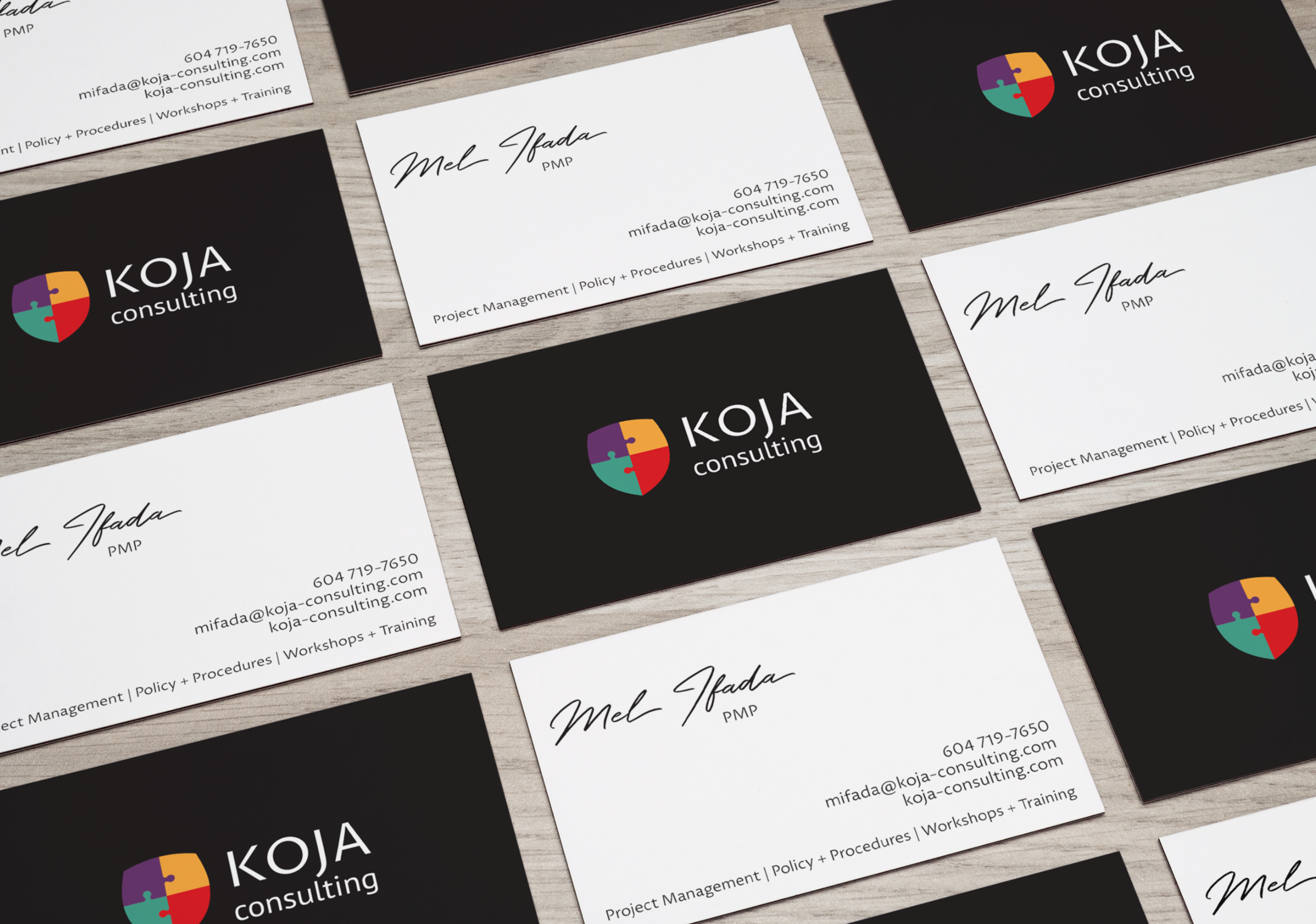
KOJA Consulting
1
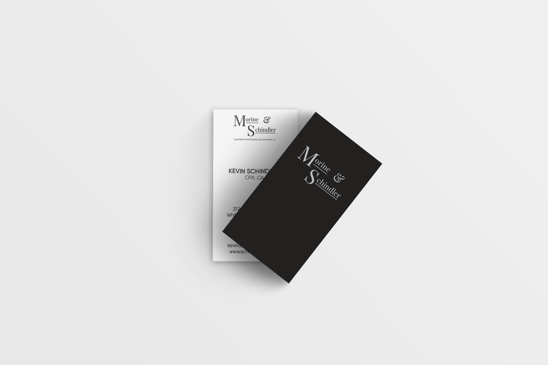
Morine and Schindler

4
Chachki

1
Charlotte’s Professional Footcare, Ltd

1
Little Elephant Camp Advertisement

1
The Fraser Valley Bride

1
Pacific Rim Magazine 2015

1
Entrada Magazine Cover Design

2
Going Down Editorial

1
Streets of Gastown Illustration